
How colour influences our mood in building design
Many people don’t think about colour when it comes to building design. However, it’s something that will affect you every day once your project has been completed.
Depending on age, gender, ethnic background and climate, the colours of an interior can dramatically affect our mood. Some colours promote productivity, energy and happiness, while others evoke feelings of anger or sadness. There are particular colours that get similar reactions from most people, depending on the shades that have been used.
Choosing Colours
When it comes to choosing colours to use inside the home or business, it must be remembered that each colour holds psychological value and has a strong influence on emotion. It’s also important to remember that small amounts of certain colours don’t have an effect on mood, whereas large amounts of it can be overwhelming if used incorrectly.
A helpful tip: Choose your textiles first, such as your carpet, as they come in limited colours. Then start choosing paint colours as they are much more variable.
Colours and Their Effects
Light colours inside a building make a room seem more expansive and airy. Lighter shades can make small rooms feel much more spacious. Darker colours are more sophisticated and warm. When painting ceilings, darker ceilings make the room feel more intimate, whereas a white or cream coloured ceiling can have the effect of the ceiling feeling higher.

Red
Lighter shades of red promote energy, excitement and strong first impressions. It’s a colour known to draw people together. However, when used in the bedroom it’s known to be a little too stimulating during the daytime, but can bring a touch of elegance at night.
Yellow
Yellow promotes happiness and works best when used in bathrooms, kitchens and dining areas. It’s energising and uplifting when used sparingly, but can create levels of anger and frustration if used in large amounts.
Blue
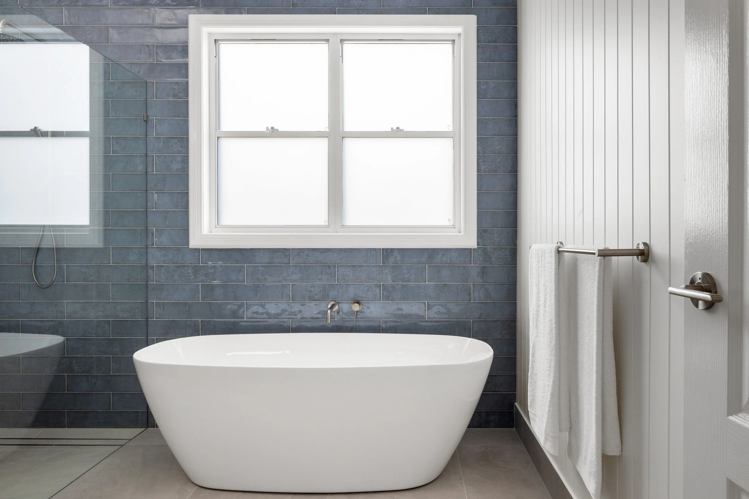
Known to reduce blood pressure, slow down breathing and calming in the lighter hues. Generally blue is used in bedrooms and bathrooms. It’s best not to use dark blues as the main colour scheme, as it can evoke feelings of sadness.
Green
Refreshing, cheerful and comforting. A true stress reliever and the easiest colour on the eye. According to some experts, it not only helps you relax, but also helps with fertility so it’s the perfect colour for the bedroom!
Purple
If you’re looking for a more sophisticated feel, deep purple shades such as ‘Eggplant’ can make a room feel much more luxurious and rich. Creating a dramatic effect, purple is best to be used subtly.
Just like a building, choosing your new colour scheme is a very personal choice, so use this article as a guide only. If you need further guidance for designing and interior design information, please don’t hesitate to contact the Struxi Design team today.